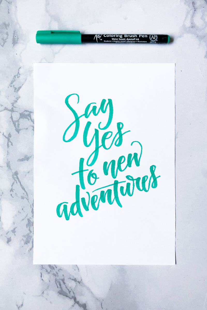
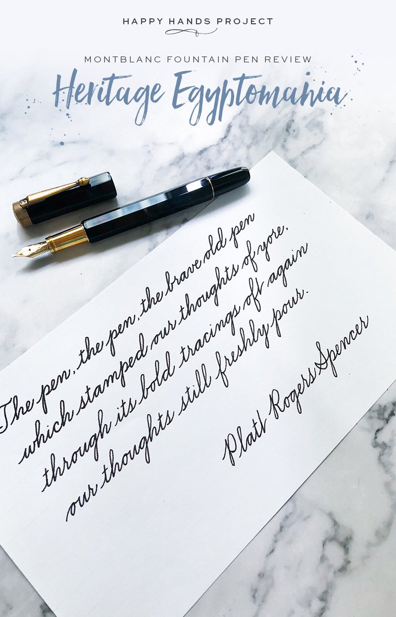
Happy Hands Project
Calligraphy by Pauline Ibarra
August 14, 2021
October 27, 2020
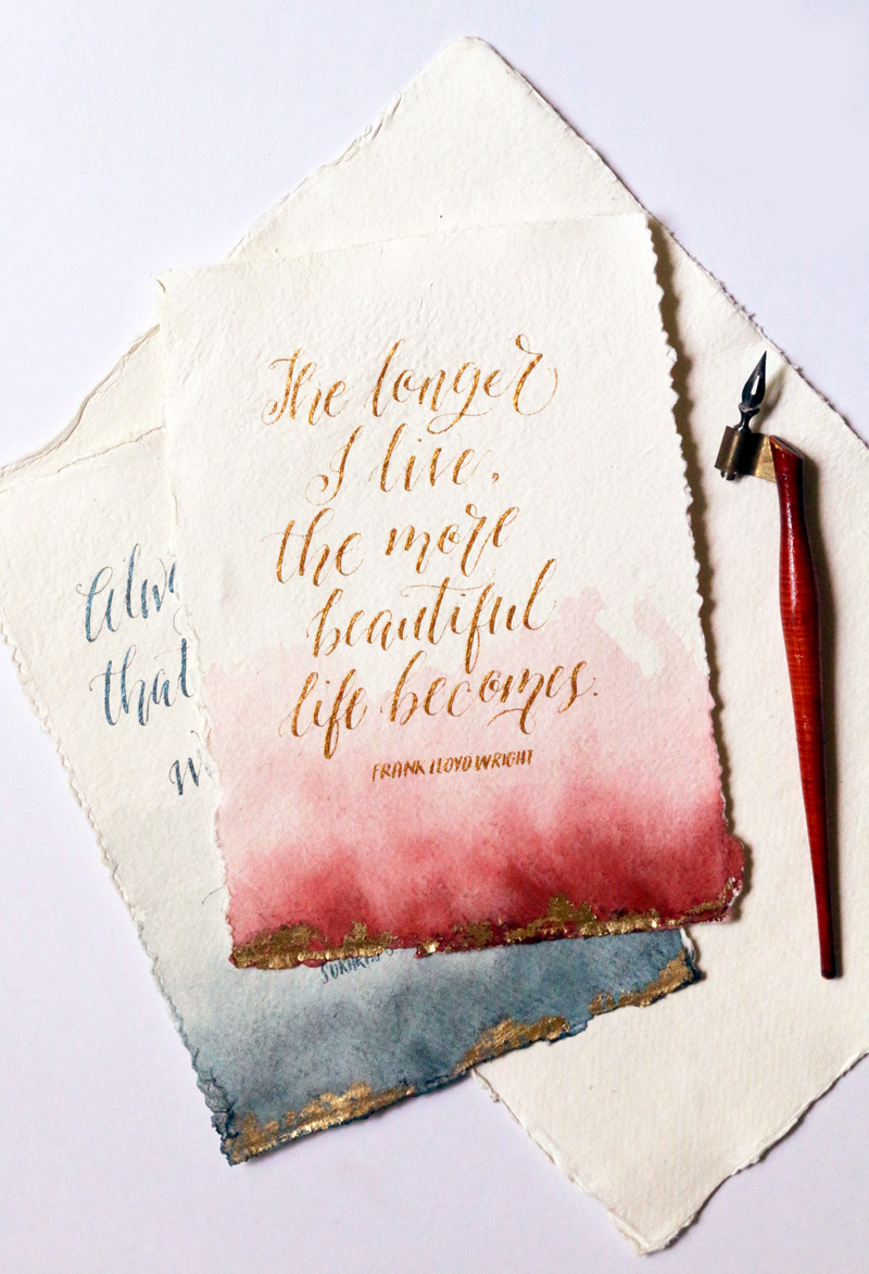
November 5, 2019
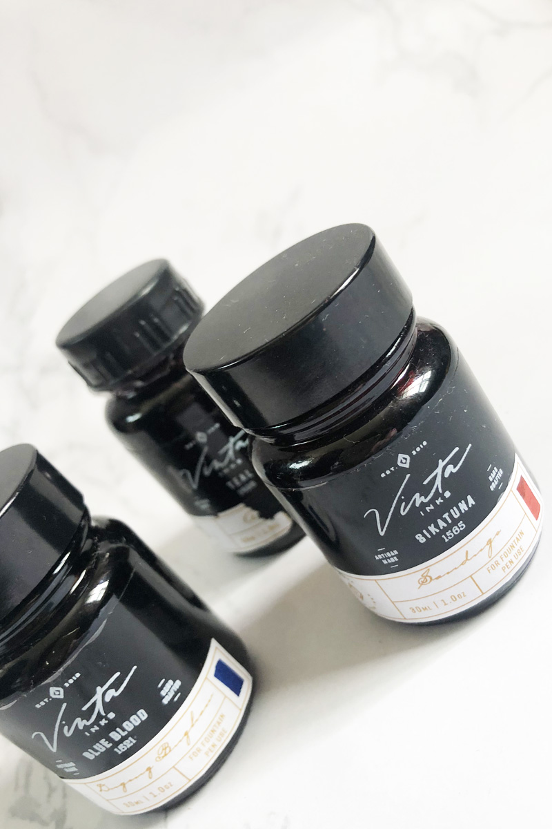
November 17, 2017
October 9, 2017
August 22, 2014
December 17, 2013