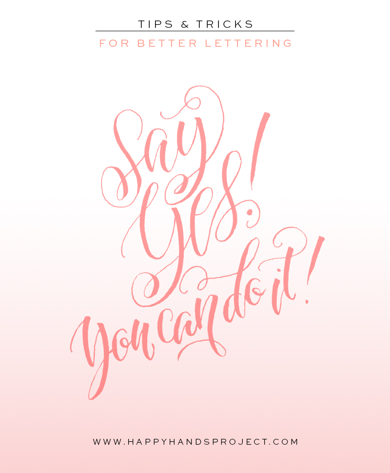
Have you always wanted to try hand lettering but have no idea where to start? Or are you trying your hand at it (no pun intended) but it’s not getting any better? I’ve heard so many say that they can’t do lettering or calligraphy because they have bad handwriting. My answer? That’s not true at all! If you feel like you’re stuck in a rut (believe me I know how it feels, I’ve been there), here are 8 tips and tricks to get your lettering mojo back. The bonus? You will get better at it!
1 :: Use the right tools
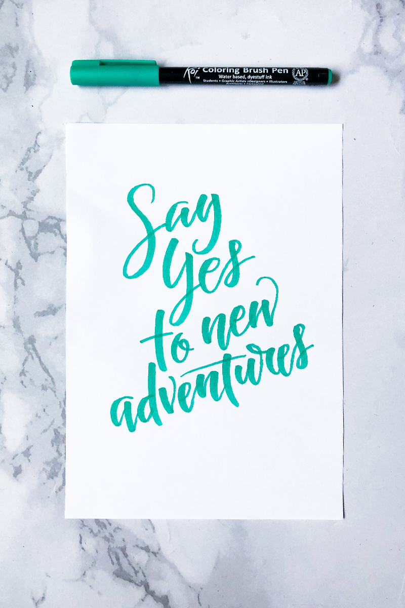
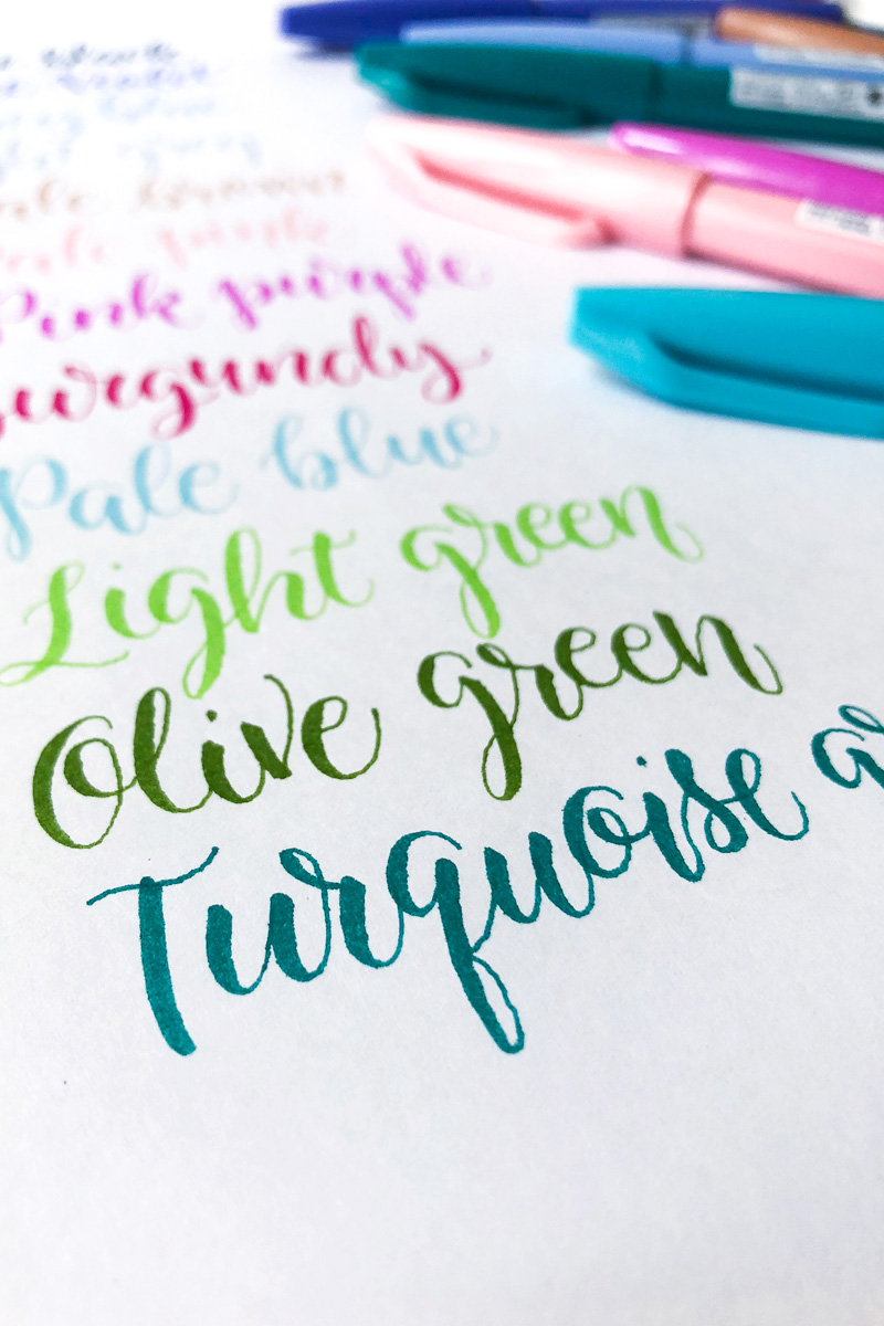
For the lettering wizard, any tool can be used to make beautiful letters. For a beginner, it’s not that easy. Try different tools and see what works best for you. What’s important is that you’re comfortable with it, and it brings out the effect that you’d like to have. Do you fancy having some thick and thin strokes in fluid script? Try a few brush pens and see which one brings out your lettering best. Do you want to draw each letter? Get yourself an HB pencil and a fine felt-tipped pen for inking. Make sure the paper you’re using does not make the ink on your pens feather and blot.
The tools for a beginner need not be expensive, nor should it be a lot. Stick to a basic set, and follow the next 7 tips.
2 :: Start small
This can apply to your collection of beginner’s tools, but I’m actually referring to the actual piece you will create. A few years back, I give A5 sized cards during the workshops I have. The participants are usually all beginners, hence, they found the A5 card too big! I cut it in half to A6, and everyone was more comfortable. A huge art piece would be intimidating, and the task would be daunting. Start with a small piece of artwork and trust me, it’ll be easier.
3 :: Use guidelines and sketch your piece
Pro lettering artists and calligraphers can create pieces without guidelines and pencil sketches. They can slant their letters consistently, and can compose their lettering perfectly without sketching it out first. Well, as a beginner, you can’t do that. If you feel that you can wing it without the use of a pencil, stop yourself and pick that pencil up. Lightly sketch the words and see how you can compose it to make it look cohesive. Your piece should look like one unit, not a group of individual words.
4 :: Focus on one style, then slowly diversify
Blackletter, italic, and a modern script style. They’re all so cool to look at, you can’t decide which one to try first! So you’ll put them all together in one lettering piece. I’d say nope—that ain’t gonna work. As a beginner, try one lettering style first (in my case, a hand-drawn cursive), then when you’re used to it, slowly try another style. When I got used to cursive lettering with a Sakura Micron, I then proceeded to learning how to use brush pens. Be patient! It’s better to master a style or two than be a jack of all trades and a master of none.
5 :: Slow down
Lettering, either with a brush pen, a ballpoint, or a pencil, is a therapeutic activity. It’s a great stress-reliever. My point is, lettering shouldn’t be rushed—it’s meant to be a slow process. When composing your art piece, sketch slowly. Study the composition and make improvements. If something looks odd, start over. Don’t try to make some quick fixes to balance the mistake out (this however, works, albeit rarely).
Are you practicing your letter forms? Fill your lined pages with drills. Write slowly.
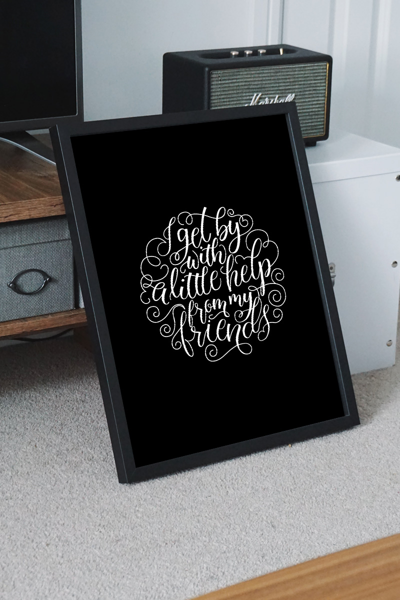
Most beginners, myself included, thought that the faster we swish our pens, the better the flourish will be. A flourish is the swirly stroke you see in the beginning or end of a word, and it’s used to add character to your lettering. It also makes your composition look cohesive. I’ve learned that flourishes that were done with a slow, steady hand have better results than quick flicks.
So relax and slow down, and your lettering will be better. Which leads me to the next tip.
6 :: Breathe
I’ve taught quite a number of modern calligraphy and lettering classes and the participants all have one thing in common—they hold their breath when writing. Seriously. Are you guilty of this, too? Here’s a trick that will help your relax—breathe in during an upstroke, and slowly breathe out on the downstroke. Sounds like yoga for the hands, eh?
7 :: Pick a style, and call it your own
As a beginner, you will be bombarded with different styles of lettering and calligraphy on social media. That’s fine! As beginners, you need all the inspiration you can get. After a while, however, it’s best to stick to one style that you’re most comfortable with. The one that you think is the prettiest. One that makes you proud, and would want to improve. Stick to it, and make it better.
8 :: Observe, study, practice
Ok, so I kind of cheated because the last tip is actually made up of 3 little tips. But these 3 words need to be done together. Look around you for signages and artworks and try to detect what makes them look good. How are the words written? How is the piece composed? Study your letter forms. Memorise how each letter looks like so your lettering will be consistent.
Last but certainly not the least, practice. We all gotta start somewhere. First attempts at lettering and composition will always be terrible, unless you were born with magical writing skills. Keep on practicing, and it will definitely get better, I promise!
So there you have it! Do you have any other tips on how to get better at lettering? Let us know in the comments!




Leave a Reply