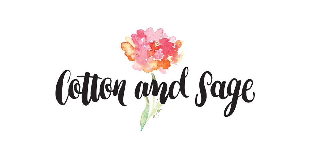
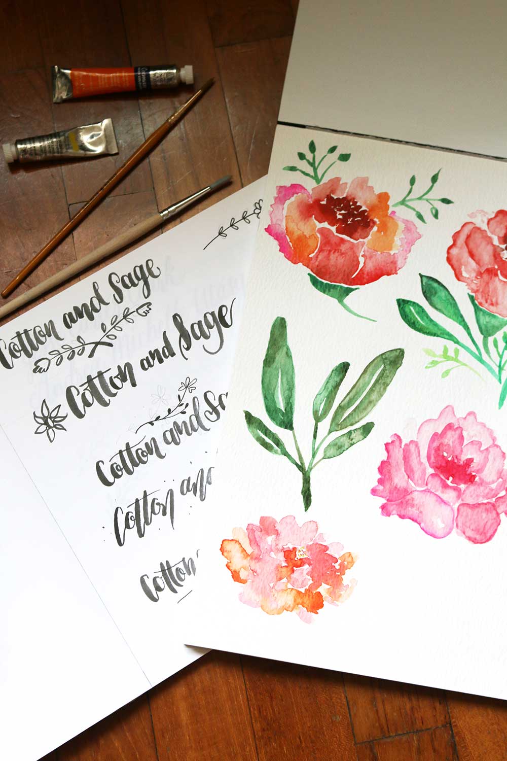
 What a lovely experience this has been! This was kind of a dream project because I get to paint florals and leaves (sage leaves, specifically) and do lettering with my brush as well. Though we eventually dropped the sage leaves while finalising the logo, we retained the 2 kinds of flowers that I painted.
Cotton and Sage is the brainchild of florist E’an here in Singapore. She specifically wanted a certain brush lettering style for the logo type, and gave me creative freedom for the watercolour florals. I liked the lettering style as it was a something that I’ve been trying myself. After a few rounds of revisions, we have arrived at the logo that you can see on the pop-up shop sign below.
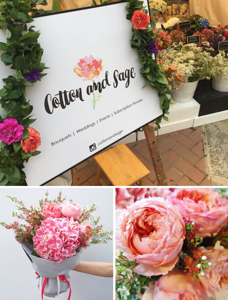
It was a breeze working on the Cotton and Sage logo, and I am grateful for opportunities like these. Oh, and did I mention that I got a gorgeous bouquet of thanks from the florist herself? It made my desk pretty despite all the inky mess.
Photo Credit: 3 bottom photos were all taken from the Cotton and Sage Instagram account.

Leave a Reply