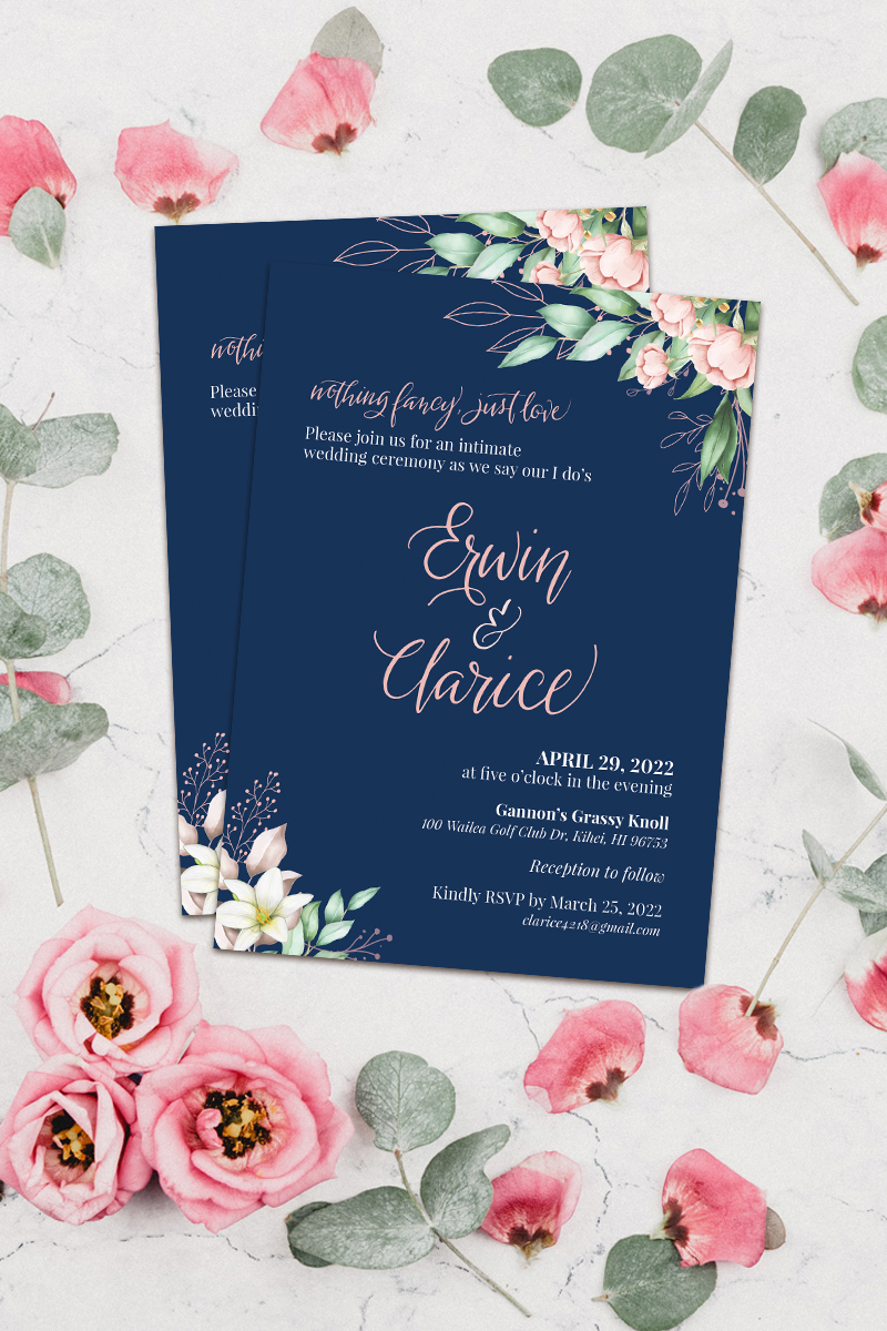
I love getting packages in the mailbox. When I shop online to top-up my art supplies, I anticipate unlocking the mailbox and seeing a brown package. I know that inside, my goodies are silently waiting in all their bubble-wrapped glory. Today was quite different though, because sitting in the mailbox was the wedding invite I designed for a couple in Florida.
I got in touch with Stella, the bride, through my Etsy shop. Initially she wanted a hand-lettered wedding logo to be used on their invitation. We finally agreed on having a customized invite as well. Oh, I love their colors! Gray is my absolute go-to color because it just has its way to perfectly blend with anything. Pair it with teal and what we had was something crisp and pristine. Like a breath of fresh air.
The design was meant to be all type, with just a hint of elements here and there. I’m glad that the couple agreed to the overall subtlety of the design. I’m also pleased that their names became the heart of the invite because, well, they’re the stars of the night after all!


Great work! I love handmade typography. It added a great touch to the invitation.
It sure does, and handwritten type makes the invites truly the couples’ own. Thanks, Katrina! 🙂